kuh-myoo-nih-kay-shun
29 completed artworks, 6 more planned
above: "ambience" video
\kə-ˌmyü-nə-ˈkā-shən\
/kə-ˌmyOOnəˈkāSH(ə)n/
Communication is a bitch.
I know.
I've tried and tried and studied and thought and considered and crafted and been extremely careful with my words and yet still I find that it's rare to be heard exactly how I intend to be heard, understood precisely how I wanted to be understood. There are barriers. Barriers in my mind, blocking my clean expression of thoughts; and, even more, there are barriers in the hearts and ears of the listeners. And, of course, in my own ears when I am the listener. But there are also barriers in between: different kinds of ambient noise, for example, that can drown out the attempt to hear and be heard, as illustrated in the short video above, which highlights the warm murmur of unintelligible connections.
Jack-hammers, garbage trucks, chirping birds, other speakers, thunderstorms, my feelings about the speaker: do I like them? Do I love them? Do I hate them? Respect them? Resent them? Do I think they're smarter or dumber than I? More or less informed? Older? Younger? Remind me of my annoying Aunt? Do I know them to be truth-tellers or habitual liars? Are they trying to sell me something? Win my vote? Is my mind wandering? Do they drone on and on? There are so many factors that shade or even obscure words by the time they've entered my ears and my consciousness.
At some point in the course of thinking about all this, I started to see that it could be the foundation for a really fun and engaging body of work. An exhibition devoted to the difficulties, frailties and fickleness of verbal and non-verbal communication, in both the analog and digital domains. So, (if you're still reading) here below is a proposal for an exhibition devoted to the artistic expression of these difficulties and impediments: the pieces I've done so far on that theme; the pieces I've done in the past that fit that theme; and even some of the pieces I'm planning that will hopefully take that theme and make it sing. Enjoy.
Norm Magnusson
* * * * *
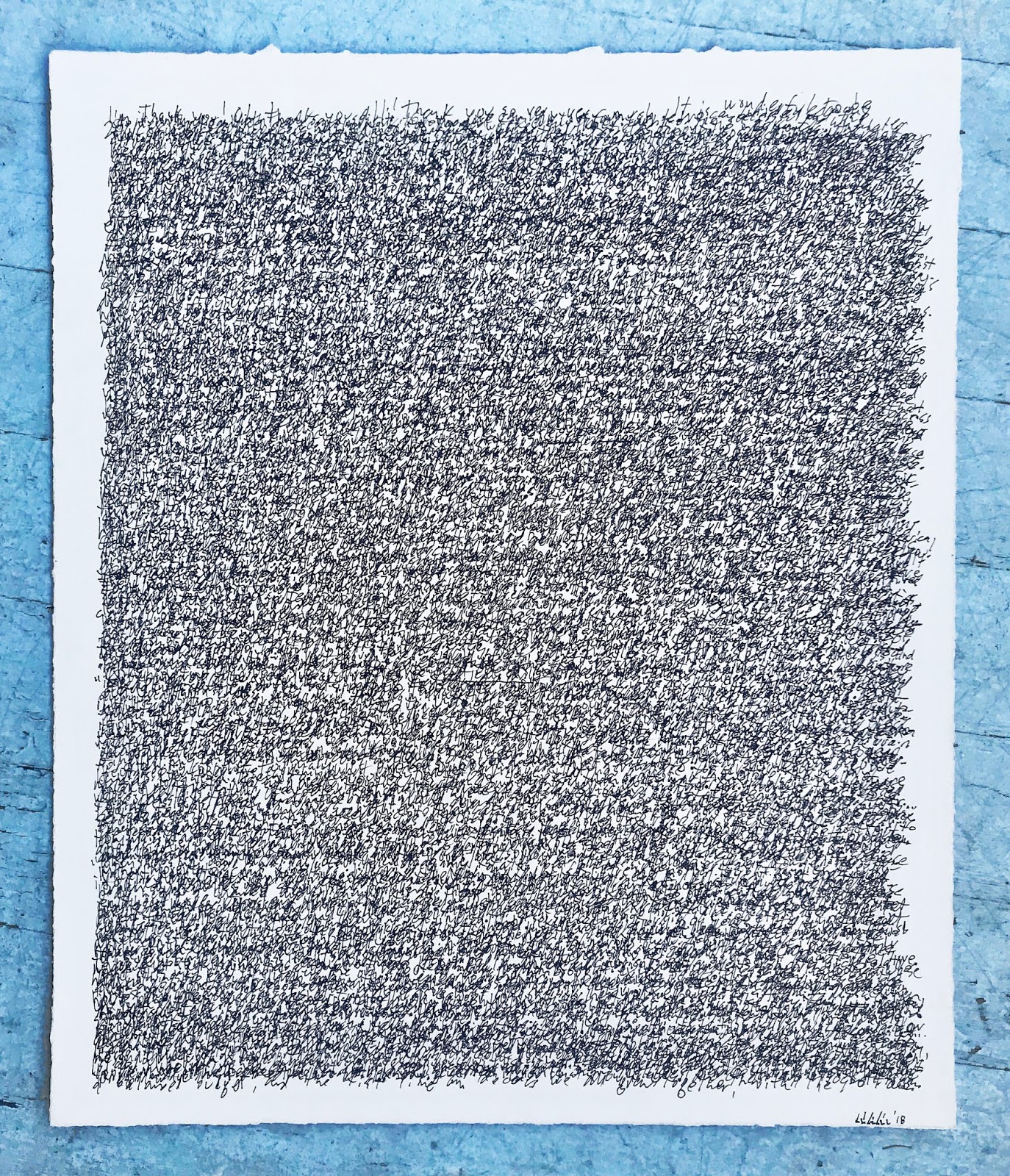
This piece below is sort of a topic sentence for this exhibition, highlighting many of the sources of difficulty in our communications.
(click on image to make it bigger)
 |
| "Communication modulator" acrchival computer print. (detail shots below) |


Factors depicted in "Communication Modulator" (above) which affect how communication happens are things such as: desired outcome of interaction; actual/perceived strengths of the speaker; likability of the speaker; personal distractions; etc.
History with the speaker, the speaker's tone of voice, etc., there are so many things that can influence how words are heard. Personally, though I consider myself to be a very sincere person, I see my innocent (and even sweet) words being taken as sarcastic or snarky much more often than I ever mean them to be that way. Here below is a piece, a cross stitch piece with two simple words on it. Are they sincere? Mocking? Ironic? These two words are are easily interpreted either way, regardless of the speaker's intentions, a fault of clarity that certainly resides in the mind of the receiver, not the speaker.
 |
| "Real Nice" 9 1/2" x 11 1/2" Cross stitch needlepoint. |
Another great example of the power of the mindset of the listener (or reader) is this wonderful "aural illusion" below. Is the voice in this little toy saying "brainstorm" or "green needle"? Think about the word "brainstorm" and play the video and have listen. Then think about the words "green needle" and have another listen. It's an amazing illusion and testament to the power of our minds to shape our perception of the information coming in. It's actually kinda scary when you think about it.
Below, on a kindred theme to "Real Nice", is "Sure", illustrating the baggage that seems to inevitably materialize during any long-lasting relationship. With a boss, with a spouse, with a sibling, or even with a public figure (see "President Donald Trump addresses a joint session of congress" further below). This baggage is created from years of hearing the words that someone actually says and measuring them repeatedly against what they turn out to actually mean, or what you repeatedly think they actually mean. In "Sure", the simple reply to the unrepresented, implied question of where to go for dinner is shown to be rich with the baggage of the personal history between speakers.
 |
| "Sure", archival computer print on acid-free paper. 21" x 29" |
In a similar vein, but reversed, is this piece below, "EVERYTHING IS JUST FINE", in which the "speaker" has pushed down the real story (below) and presented a stiff upper lip version that avoids any discussion of the reality of their emotional life. Too many people (men especially) are like this, self-censoring to the point where true communication and emotional sharing is just not happening.
 |
"EVERYTHING IS JUST FINE" mixed media on acid-free archival watercolor paper. |
text underneath the surface:
EVERYTHING IS
CRASHING DOWN
I'M SAD I'M BROKE
I'M NOT GOOD
ENOUGH I'M TIRED
I'M FILLED WITH BAD
FEELINGS I DON'T
QUITE UNDER-
STAND. SOMETIMES
I SEEM JUST FINE
BUT MOSTLY I FEEL
OUT OF CONTROL
AND OVER-
WHELMED WITH
DESPAIR.
Whereas the piece above is an example of sub-concious, or emotional obfuscation, in the political realm there are numerous examples of intentional (intellectual) obfuscation. Here below is a piece from a bigger series I've done entitled "Finding the Truth", in which I find the true message buried within the bigger message of a political speech. No words added or subtracted or moved around. Same with punctuation. Certain words highlighted in red to reveal what I believe is the true story within the delivered story. (more from this series can be seen at the bottom of this blog in the appendix.)

"President Donald Trump addresses a joint session of congress"
2017, archival computer print, 40" x 30"
2017, archival computer print, 40" x 30"
(verbatim from prepared transcript - below: highlighted words only)
Tonight, as we mark the celebration of our vandalism of truth, liberty and justice --I am here to deliver a message to the middle class. It’s been a little over a month since my inauguration, and I want to take this moment to announce the government corruption and deregulation that threatens the future of their financial dreams. For the American family that loses their jobs, their income, or a loved one, because my Administration — a network of lawless Christians — will be making it easier for companies to abandon protective policy and depress wages, we do not truly care. Mandating no choice is the plan for women’s health, and to advance the common good, a woman should not be free to choose and must not have a voice. Finally, to keep America Safe we must, as the Bible teaches us, all share faith in and all salute the same God. From now on, America will be guided by our vision. God bless you, and God Bless these United States.
When I was a kid, in 1970 or so, Richard "I am not a crook" Nixon said, with regards to the Watergate fiasco, and by way of a non-admission admission of culpability, "Mistakes were made." Even as a youngster, this phrase seemed peculiar. Not the least of it being that if I had ever tried to use this "king of non-apologies" with my mom or dad, I woulda been grounded for life! Here, I take the desire to say "something that SEEMS to be saying the right thing but in fact actually isn't" one step further, presenting the mere shadow of the words, pressed into paper.
 |
| "MISTAKES WERE MADE", 21" x 17" hand embossed archival paper. |
Below: facts/lies. Etched glass. A deeply political piece in this era of "fake news", one side reads "FACTS", the other reads "LIES". The effect of seeing both through this glass is obfuscation.
 |
| "FACTS/LIES", Etched plate glass. 54" x 22" |
* * * * * * * * * * * * * * * * * * * * * * * * * * * * * * * * * * * * * * * * * *
 |
| "NO MEANS NO" Acrylic on canvas, 42" x 42" |
Above: "NO MEANS NO", about the ability of some to willfully ignore the messages that are given to them. It always seemed strange to me, this sentence. Unnecessary, really, when a single "no" alone should suffice. Though it takes me immediately to the realm of sexual consent (and assault) and #meToo, it also evokes other situations: a baker wagging their finger over a fresh plate of brownies or a pristine cake destined for somewhere other than the immediately present hungry hordes or a parent telling their child for the umpteenth time that they are NOT allowed to go hang out with Eddie and Bill to "play marbles".
Our feelings about the source of the communication can have a great effect on how we perceive it, too. Take this quotation below:
 |
| "Ben Hitler" archival computer print. 14" x 12" |
Does your feeling about the quotation change if you know that it's actually from Adolf Hitler, as the small type attribution notes? And what would happen if you read this quotation while looking at a picture of Hitler? It would certainly change your sense of the words. Simple but profound, this phenomenon of emotional listening.
Frequently, people speak to us but, instead of listening with our heads, we should actually be listening with our hearts. On these occasions, we might miss entirely what they're trying to communicate because of our successful engagement with their words and our failed engagement with their deeper meaning. "Read between the lines", as they say. This piece below, "horse", is about that "heart/head" problem, substituting "feeling" words for the more concrete and intellectual numbers that are traditionally used in a paint-by-numbers piece.
 |
| "horse" archival computer print on acid-free board. 24" x 20" edition of 25. |
* * * * * * * * * * * * * * * * * * * * * * * * * * * * * * * * * * * * * * * * * *
The digital era was supposed to make communication clearer; at least that's one of the promises I believed. We could call and email and text, and communications were going to attain a level of precision that we'd only ever dreamed of before. Well, it hasn't actually gone down that way. In fact, technology almost seems to have amplified the inherent difficulties. This morning, I read a Zen proverb: "If we are facing in the right direction, all we have to do is keep walking." The sad truth for most communication is that it is facing anywhere from a little to a lot in the wrong direction. And then it keeps walking. And by the time it gets somewhere, anywhere, to you, to me, it is frequently so far off its intended trajectory as to be unrecognizable. Ineffective. Just plain wrong. KWIM?


Ahhhh, communication in the digital age. ROFLMAO. It is still difficult AF, as always, and maybe even more so. (IMHO)
This mock up below collects popular acronyms from escort and hook up sites on the internet. The arcane acronyms create an exclusiveness of communication, not to be understood by those who are not in the club. Luckily, understanding and knowledge and ultimately, I guess, entry into that club is just a couple of clicks away. The Urban Dictionary, for example, is a great source of discovery for all this information.
 |
| "Comforters" (planned) appliqued acronyms on a stained down comforter. King sized. |
In January of 2016, I got a new smartphone. An iPhone 6. With doubleplusgood voice recognition capability. Now, finally, I could dictate to Siri; I've always been a good enunciator and used to do a lot of voiceover work for radio and tv, so I thought that Siri and I would get along famously. We really didn't. Siri frequently gets things very very wrong. That got me thinking even more about how technology is not necessarily the friend of precise communication. And that got me thinking about how I could make this phenomenon into a piece of art.
 |
| "Armed militia" (not yet framed, will be approx. 100" tall) |
(CLICK ON ANY IMAGE TO MAKE IT BIGGER)
This piece above is the first I made with Siri. I held Siri up to an NPR broadcast about the siege at the Oregon wildlife refuge that happened in February, 2016. Siri kinda got a little bit of it (maybe enough to know what's happening from reading its version) but Siri also missed a whole bunch. Here above is Siri's text (in letters cut out of fleece camo fabric and glued onto other camo fabric) and here below is the actual text from the broadcast:
The standoff between and armed militia group and law enforcement at the Malheur Wildlife Refuge may be nearing an end. Three more people who had been holed up at the refuge are in custody but several others remain there. Carter Evans has the latest from Burns.
Siri text:
Standoff between the arm Alyssa group at lawn force meant up about your wildlife refuge make me nearing and three more people with that hold up at the refuge custody several others remain have the latest from birth.
And here, below is a mock-up of another finished piece, created in the same manner: Siri held up to NPR, this time though, it's a broadcast about a terrorist bombing in Brussels. (Listen here.) This piece has letters cut out of cotton muslin, affixed and sewn onto a Muslim prayer carpet. First, the transcript from NPR:
We are turning our attention this morning to a photo. It comes from the security cameras at the airport in Brussels. It is pretty grainy, but Belgian authorities say the three men in it carried out the deadly attack at the airport yesterday. We learned new information about the men in this photo during a press conference in Belgium a short while ago. And let's talk about that with NPR's Soraya Sarhaddi Nelson, who is in Brussels and on the line. Soraya, good morning.
SORAYA SARHADDI NELSON, BYLINE: Good morning, David.
 |
"PR prayer rug", 88" x 33"
SIRI'S TRANSCRIPTION:
WE ARE TURNING OUR ATTENTION THIS MORNING TO A
PHOTO SECURITY CAMERAS AT THE AIRPORT IN BRUSSELS IT IS PRETTY GRAINY 30 SAVE
THE THREE MEN IN A CARRIED OUT THE DEADLY ATTACK IF YOU’RE BORN YESTERDAY WE
LEARNING NEW INFORMATION ABOUT THE MEN IN THIS PHOTO DOING A PRESS CONFERENCE
IN BELGIUM SHORT WHILE AGO SO HOW DO YOU NELSON MORNING GOOD MORNING DAVID
I love the part about "THE MEN IN THIS PHOTO DOING A PRESS CONFERENCE IN BELGIUM" because so much of a terrorist attack like that truly IS a p.r. move.
So: back to Siri. Why did/does Siri get things wrong? So much more wrong than human ears even. (Or, at least, many human ears?) Well, first off, the voice recognition software is not that advanced yet. But secondly, Siri doesn't have context. Context is both friend and enemy to faithful hearing. When someone is talking about the Super Bowl, say (don't ask me why that example popped into my head), we are going to expect to hear football words: touchdown, goal post, tackle, guard, pass, etcetera. And words the speaker might utter that are not football words might well be mis-heard. Again with the random examples: "bun" instead of "run", "flits" for "blitz", "harassing claim" for "passing gain", and so on and so forth, for example. Below, is "frustrate chin", a simple epic Siri fail on one word. That the word itself sums up the emotional aspect of this attempt to get Siri to work as intended is a lovely conceptual bonus of this piece.
 |
| "frustrate chin", size tbd |
"know thyself" (below) is good advice, but is difficult to follow. Here, even the language itself is hard to understand. Google translate says the Latin for "know thyself" is "scio te ipsum" and when you type that onto this blog window, autocorrect suggests "scion the opossum", which is what I've put here, adding one more level of difficulty to additionally illustrate the not-always-helpful inclinations of autofill and the not-so-simple or straightforward proscription to "know thyself."

"know thyself" acrylic on canvas, 39" round, 4" deep
Scour the internet for some classic mis-heard song lyrics, the Bee-Gees singing about "Bald headed woman" (not "more than a woman", as it actually is), Joni Mitchell singing about "a gay pair of guys put up a parking lot", and Jimi Hendrix exhorting " 'scuse me, while I kiss this guy." It's not just Siri, or external context, it's also our own inner context that can shape what we hear. Maybe some latent homosexuality has charged up our ears for Joni and Jimi or a bad haircut has changed the way we hear the Bee-Gees. Regardless, how many times have you misheard a lyric in a song? Sang it in the shower, sang it in the car and then maybe even sang it to your friend who laughed and pointed out that you just plain had it wrong. This is exactly the kind of stuff I'm talking about.
above: an animated gif of a proposed lenticular piece, where the image changes as your vantage point changes. Below: a Photoshop mockup of a piece (to be painted) that will be about 60" square.
 |
| "Meterorologist", 24" x 20" |
And it's not just in our ears, sometimes our words miss the mark, too. Too vague, overly simplistic or overly complex, as in this piece below:
 |
| "Barnyard fowl" Watercolor on archival paper. |
The text on the inside of the little fence reads: "Abstain from quantifying your brood of barnyard fowl prior to
their emergence from their
embryonic encasements." Which some shrewd readers will understand as: "don't count your chickens before they're hatched."
The theme of technology obscuring rather than clarifying is also, simply, shown in this piece below, a photoshop mock-up of another planned painting; it is the Lord's prayer in binary code, each one or zero a shade of blue or grey or white, together making a heavenly skyscape with fluffy God-clouds. I like how, translated into this code and these colors, some parts of it are beautifully legible, while others become invisible, impotent couriers of attempted communication.
 |
| "The Lord's prayer (with doxology)" archival computer print 16" x 24" |
Like many things in our lives, communication is made up of a conglomeration of discreet bits of information. In "The Lord's prayer (with doxology)" (above) those discreet bits are bytes, individual 8 character groupings of ones or zeros that create the binary code that computers can read. And here, directly below, it's the 26 letters of the English alphabet and assorted punctuation marks. Together, and in a certain order, they create a poignant and famous speech, "The Gettysburg Address". But kept in their own little sections, segregated by letter, they lose one power but gain another, as the communication goes from literal to symbolic, working on different parts of our brains, trading clarity for confusion and in the process, inviting a new interpretation.
 |
| "The Gettysburg Address, segregated by letter" archival computer print on treated paper. |
* * * * * * * * * * * * * * * * * * * * * * * * * * * * * * * * * * * * * * * * * *
I thoroughly enjoy this piece below, part ready made, part text art, part conceptual art, and all about this theme of communication: when we change our perspective vis-a-vis the message, we can sometimes end at the exact opposite point to where we started. This below is a french flash card. On the front is the word in English: "up" and on the back is the French: "en haut". And upside down, of course, is "dn". Which I read as "down". Nearly everybody who sees this piece scratches their head and wonders why it's framed and hung on the wall. We see what we see first and it's frequently hard to see further without a prompt, or some sort of key.
 |
"dn/up" framed flash card, 6" x 8"
|
Ambiguity. Apart from song writers and poets (and White House press secretaries), most of us are not after any intentional, interesting ambiguity and yet, there it is, every day, inadvertent, in so many communications. The piece below, "maybe", is a mock up of paper weaving of the two words together -- both are legible but neither clear. It's a mash-up of opposing concepts, where the sum is less than the parts. It's a art/design meme executed by many artists over the years and brought to my attention by the artist Carla Rozman. (see hers here: https://abcwfg.blogspot.com) Here's my version, in woven paper: 
"maybe", woven archival print on photo paper 15" x 22""
 Using almost the exact same words is this piece, above, representing one of my favorite fresh American idioms of the last decade or so. It's used as an emphatic "no" with an edge of snark and maybe a whiff of condescension but I love it so much. "Yeah, no." Imagine you're learning English and you come up against this nonsense phrase. How you gonna reconcile these two opposing words, one of them slang, with their true meaning? Below is another example of ambiguity, this coco mat, traditionally used to clean dirty shoes, bears the message "KEEP CLEAN". Keep what clean? Keep this mat clean? Keep your shoes clean? Keep the floors beyond clean? 
"KEEP CLEAN" will be paint on coco mat, approx 18 x 30"
I've made two identical coco mats. One sits on the floor by the door (above) and the other is hung on the wall inside. The meaning imparted by the hanging one seems to me to have nothing to do with either of those other interpretations. 
The meaning of these two words changes based upon their location, their context.
In "hook up" (below), the meaning changes over the years. Before we ever had a "hook up culture", facilitated by Tinder and Grindr and ArrangementFinders.com and a general attitude of fleeting romantic engagement without any romantic entanglement, we would "hook up" with our neighbor to talk about the pesky raccoon that's getting into our garbage or "hook up" with the boss after work for a beer. In the course of a few years, that phrase has gone from "rated G" to "rated X". Woe be upon them who haven't kept up and ask their neighbor's wife to hook up later one balmy weekend evening.
"Let's hook up later!" mixed media.

"Thoughts and prayers" Embroidery thread on linen napkin. 16" x 16" unframed
I have a personal love for this piece below, it launched an entire monologue I wrote and performed. Will the person who taped it in their shop window be back in 10 minutes or was the note taped there 9 minutes ago and they'll be back in 1 minute? The sign, though in common use, and well-intentioned, is not as useful as a sign that reads, say, "Back at 3:15". This version hangs on my front door right now and I can watch from my computer as it turns away political proselytizers, Jehovah's Witnesses and new friends who haven't quite gotten up (or down) to my speed yet. (Which reminds me of a great line from Quentin Crisp's The Naked Civil Servant, in which he writes: "don't try keeping up with the Jones', drag them down to your level, it's much more fun that way.")

"BACK IN 10 MINUTES", ball point pen on card stock, adhesive tape, 9" x 6"
* * * * * * * * * * * * * * * * * * * * * * * * * * * * * * * * * * * * * * * * * *
Well, it's always political season somewhere, it seems, and the speeches are always flying and it reminds me of how easy it is to zone out in the middle of a sermon or a lecture or a political speech perpetrated upon the public by anyone other than the most talented and dynamic orator. (Maybe you even zoned out a little bit in the middle of that last long sentence!) What happens when there are too many words (sometimes even a :60 commercial is too verbose) is that the words lose their intended effect, at the minimum, and lose all their power and even meaning, in the extreme. Here below is a speech by a politician announcing their presidential bid (you gotta love the singular "their" & "they" - the source of this speech is unimportant to my concept.). It's word piled up on top of word, the communication of their thoughts buried and suffocated under their enormous mass. I transcribed the speech with a black sharpie, top to bottom and then started again at the top. It only took 5 passes to write the entire speech on this piece of paper, but the effect is just what I had hoped for.
 "Announcement", Sharpie on watercolor paper. 21" x 18" unframed  "I'm sorry, a thousand times I"m sorry" , "I'm sorry" written 1,000 times in graphite on a piece of watercolor paper. |
Though more on the concept of repetition than the reality of illegibility, this piece above is a perfect segue to the one below, about our ability to read the written word. This one uses a font created by designer Daniel Britton (https://danielbritton.info) who describes it here:
This typeface recreates the feeling of reading with Dyslexia for a non Dyslexic person therefore creating empathy andunderstanding for the problem. Like in any case only once a problem is fully understood can it be solved.How the typeface does this is by breaking down the reading time of a non-dyslexic down to the speed of a dyslexic by removing around 40% of each letter and making each letter almost illegible in turn then slowing down the users reading experience to the speed of a stereotypical Dyslexic person and then recreating the frustration and embarrassment of everyday reading. I believe that once that Dyslexia is properly understood we can create better learning conditions for Dyslexic students and let them excel in the same way that every other person can. Just think, there are around 8 Billion people living in the world right now with around 10% – 20% of the population being Dyslexic, so that gives you around 160,000,000 Dyslexic people on the planet, if we can increase our understandng and give the correct help to these people just think how many more Richard Bransons, Elon Musks or Boyan Slats we can produce?

The mock up above (size and medium tbd) reads "try it with dyslexia" and illustrates beautifully (if in extreme) one of the ways that communication can fall short of its intended goal. A variation in a gene that makes the "receiver" or, in this case, the reader, less perfectly able to understand the message.
* * * * * * * * * * * * * * * * * * * * * * * * * * * * * * * * * * * * * * * * * *
How about the ubiquitous super market window butcher paper painted signs? Would you even notice if you walked by and, instead of advertising 2 cans of creamed corn for 99¢, they were engaging you in a riddle? Here below is a mock-up of a piece meant to represent message saturation and expectation prejudice. I'd wager that 95% of people passing by a supermarket displaying these signs wouldn't even notice that they weren't hawking pantry staples or produce specials.
 |
| "two doors" planned installation |
 |
| "Fish", archival computer print. 40 x 38" |
"Fish" (above) is a perfect piece for this show. "GHOTI" is an interesting word construction that illustrates some of the inherent difficulties of the English language, and, by extension, communication using it. The word uses the "gh" sound from "enough", the "o" sound from "women" and the "ti" sound from "emotion". Ffff, iiiii, shh. Fish.
For more information on "ghoti", click here.)
Whereas "GHOTI" teeters on the edge of needing explanation to be understood and enjoyed, the "proximity and distance" series (below), in my opinion, does not. From a distance, they gain resolution.... (here, below, is my statement on this body of work)
The internet is a great forum for bringing people together. It is also, by nature of how we use it, a great isolator -- creating an ersatz society where we can enjoy each other’s company from the privacy and solitude of our own homes. It provides proximity from a distance and allows us to filter our personas through its fun house mirror, presenting to the world only the images we have chosen.
On Facebook, there’s no more manicured presentation of our best face forward than our “profile picture.”
For “Proximity and distance”, I placed my iPhone right up against my computer screen, resting it in the hinge of my laptop. I scrolled each 50 x 50 pixel profile picture into position and snapped the photo, the mechanics of the act restating the very theme of this series. I then brought these blurry photos into Photoshop and further decreased their resolution by making each one a mere 13 pixels across. At this point, I enlarged them as much as I could (3200%, up to 418 pixels across), and took a screen grab of them at that size.
Finally, echoing the social nature of Facebook, I connected them to other pics that felt right with them due to color or composition or some other factor.
This series presents the paradox of communication via social media in all its colorful, amorphous glory. The photographs range from recognizable (person on a horse) to completely abstract; they are, at once, familiar and unfamiliar and, like the people behind them, they evoke emotions ranging from soothing to disturbing to haunting.
 |
| "Kimberly and Monica" 2014. Archival computer print. |
 |
| "Unknown and Jessica" 2014. Archival computer print. |
 |
"Shelly and Karen" 2014. Archival computer print.
|
 |
"Patty and Zoe" 2014. Archival computer print.
(the entire series can be seen here.)
Below is a planned lenticular further illustrating the difficulties with non-verbal communication, it's a classic optical illusion that actually has a name "My wife, my mother in law" and is one of numerous optical illusions on this very theme.
"My wife, my mother in law" (planned lenticular)
|
* * * * * * * * * * * * * * * * * * * * * * * * * * * * * * * * * * * * * * * * * *
It's not just strings of words that can be reconfigured to be misleading or revealing (as in the Trump speech, earlier), individual words, too, are dynamic in their meaning and usage.
Words, phrases, sentences, speeches, books, they all communicate, and most are intended to communicate, a particular thought in a particular way. But all too often, they fail in their specificity, resulting in either poetry and confusion. Or both. And something as seemingly inconsequential as a capital letter or a missing space can change everything.

"lower caste" Acrylic paint on archival computer print on canvas, mounted on reclaimed wood. 27" x 48"
"lower caste" (above) and "The pen is mightier than the sword" (below) are both about the fickle, fragile nature of communication. One missing space, or one mistake in capitalization changes everything. A thought also illustrated by the planned neon piece further below (in the "ALSO RANS" section), "in complete control".
 |
"the pen is mightier than the sword" acrylic on bedspread 72" x 70"
|
"dreadlocked", below, and "my little porny" (very bottom of blog, in the "ALSO RANS" section) both illustrate how even one simple letter can change meaning completely. "my little porny" begs us to consider pornography for children and the effects of pornography on children:
Consumption of pornography is associated with many negative emotional, psychological, and physical health outcomes. These include increased rates of depression, anxiety, acting out and violent behavior, younger age of sexual debut, sexual promiscuity, increased risk of teen pregnancy, and a distorted view of relationships between men and women. For adults, pornography results in an increased likelihood of divorce which is also harmful to children. Read more from the American College of Pediatrics here.
And I love the dreadlocked piece because it's not just about the fragility of precise communications, but also about our still mostly homogeneous Congress. Seriously, could you imagine a senator with dreadlocks? Why not?
 |
| "dreadlocked", acrylic on newspaper, 56 x 56". |
Below: a "word clock", like those old flip clocks, where the little flap flips down as each minute or hour (or even second) passes. Three rotaries of words, each spinning at its own rate: 20 seconds per flip, 10 seconds per flip and 5 seconds per flip. Each permutation will be shown and the whole thing will repeat every 87 or so and there will be 15,625 possible combinations of words.
The words that will be used:

Still, through all the difficulties, the pitfalls and potential traps and danger zones of communication, it happens. People communicate with each other. They make it happen, they share their thoughts and feelings and abstract concepts and quantum physics and heartbreaking poetry. Communication happens. This proposed painting, below, is a perfect piece to end this show with, providing hope for this wonderful instinct of ours to express ourselves to others and to hear what they're saying, in return.

"Adaptation" planned painting on camouflage material.
* * * * *
Norm Magnusson
Narrative bio:
Norm Magnusson is mildly renowned all over the world.
He’s received a NYFA Fellowship (2014-2015) for sculpture, a Pollock-Krasner Foundation grant for painting (1998-1999), and a Lower Manhattan Cultural Council grant (2008-2009) and a NYSCA grant (through the Center for Sustainable Rural Communities - 2014), both for public art installation.
He is the founder of the art movement “funism”, whose basic tenet is that art should be accessible to all and should be as much fun to look at as it is to think about.
As a visual artist, he has shown in galleries and museums in New York and New Zealand, London and Paris and all over the United States. His work is in private and museum collections around the world, including NY’s MoMA (Franklin Furnace Artist’s Book Collection) and he’s been reviewed everywhere from the NY Times to the Washington Post to the Utne Reader, Sculpture magazine, TrendHunter.com and many other national and international magazines, websites and blogs.
His “historical markers” and “decorating nature” series have both gone viral several times on the internet.
As a curator, he has brought together exhibitions such as “FU”, which examined and illustrated U.S. fair use laws as they pertain to visual artists; “The Museum of Controversial Art”, which re-created some of the most controversial art through the ages; “Beautiful nonsense”, which consists of objects and art meant to challenge the intellectual sure-footedness with which we move through our everyday lives; and “abc@WFG”, an exploration of the question of what constitutes text-based art.
He speaks often on art and curation and is a frequent panelist on the arts of the Hudson Valley.
As an educator, he’s taught art to under-privileged kids in NYC and over-privileged kids in Woodstock, NY. He created a 12-class curriculum entitled “Art that’s changed the way I see the world around me” in which artists and gallerists and rock stars and film makers and authors and academics came and spoke on that topic with visual and audio aids.
For the last 5 years, on August 29, the date of its world premier in Woodstock, NY, Magnusson has produced an anniversary concert of John Cage’s 4’33” at the WAAM Museum in that town.
He is the co-founder of FISHtheMOUSEmedia, a developer of educational apps for iOS; where his “Animal alphabet” app was widely acclaimed and honored with a prestigious Gold award from the Parents’ Choice Foundation.
He serves on the board of directors of two 501(c)3 organizations, CultureConnect and GoodJTDeeds and is the father of 3 wonderful kids, all of whom are especially talented at seeing the world around them with appreciative eyes and a grateful heart. He reckons this is his proudest accomplishment.
Resume:
Awards / fellowships
NYFA (sculpture) 2015
NYSCA through CSRC (installation) 2014
Lower Manhattan Cultural Council (installation) 2008
Pollock-Krasner Foundation Grant, (painting) 1998-1999
Public art projects
2014 “O, pioneers” The Lawn on D, Boston, MA
2014 “Miners” Snyder House Historical Site, Rosendale, NY
2014 “On this site stood” Center for Sustainable Rural Communities, Schoharie, NY
2013 “Hidden gallery walk” Palenville, NY
2013 “I want to sleep with America” Woodstock, NY
2012 “Far and wide” Woodstock Artists Association Museum, Woodstock, NY
2012 “Historical tense”, Artspace, New Haven, CT
2011 “O+ Festival”, Kingston, NY
2010 “The art of inspiration”, Sculpture installation, Time Warner Bldg, N.Y., NY
2010 “Sculpture Key West Invitational,” Key West, FL
2009 “Sculpture Key West 2009,” Key West, FL
2008 “Strange bedfellows” Le Petit Versailles, NYC
2007 “On this site stood,” The Aldrich Museum of Contemporary Art, Ridgefield, CT.
2006 “The Byrdcliffe Outdoor Sculpture Show,” Woodstock, N.Y.
2006 “Unexpected Catskills” Byrdcliffe Arts Colony, Woodstock, N.Y.
2005 “Karen DeWitt,” Historical marker with political content installed on
Heart’s Content Road in Greene County, N.Y.
2004 “Do unto others,” “Practice what you preach” Two :30 videos that aired 96 times on national tv leading up the Nov., 2004 election.
2003 “Jesus loves you, Bush doesn’t” Viral internet project
2000 “Pull toy” Cow Parade, Riverside Park, N.Y., N.Y.
Solo Museum Exhibitions
2011 “Public service public art project” The Pember Museum, Granville, NY
2007 On this site stood" The Main St. Sculpture Project of
The Aldrich Museum of Contemporary Art, Ridgefield, CT.
2003 “Metaphorical Menagerie” The Pember Museum, Granville, N.Y.
2001 “Image and Allegory,” The University of Mississippi, Oxford, MS
2000 “Norm Magnusson -- American Painter” The Springfield Art Museum, MO
Solo Gallery Exhibitions
2015 “Funism” SUNY Ulster, Muroff-Kotler Gallery, Stone Ridge, NY
2013 “Decorating nature” Evolve Design Gallery, Woodstock, NY
2009 “Descent into the political” Bard College at Simon’s Rock, Great Barrington, MA
2008 “America's Seven Cardinal Virtues” Van Brunt Gallery, Beacon, N.Y.
“Youth Culture in America” Muddycup Gallery, Kingston, N.Y.
2006 “America’s Seven Deadly Sins” Van Brunt Gallery, Beacon, N.Y.
2004 “Figures of speech in paint” Inquiring Mind Gallery, Saugerties, N.Y.
2003 “Vacation” Spike Gallery, N.Y., N.Y.
2002 “After the 11th” BridgewaterFineArts, N.Y., N.Y.
2001 “The Animal Alphabet” Bridgewater/Lustberg/Blumenfeld, N.Y. 2001
1999 “Central Park Animals - Then and Now” The Arsenal Gallery, Central Park, N.Y. , N.Y.
1998 “American Paintings” Bridgewater/Lustberg Gallery, N.Y.
1997 “Norm Magnusson” J.J. Brookings Gallery, San Francisco, CA.
1997 “Travelogue” Bridgewater/Lustberg Gallery
1996 “Norm Magnusson” Picturesque Gallery, Akaroa, New Zealand
1995 “Bestiary” Bridgewater/Lustberg Gallery
1994 “The Normandy Paintings” Bridgewater/Lustberg Gallery
1993 “Recent paintings” The Gallery Upstairs at Flamingo East, NYC
1992 “Norm Magnusson” The Gallery Upstairs at Flamingo East, NYC
Group Museum Exhibitions
2016 “Exquisite porch” Morean Arts Center, St. Petersburg, FL
2015 “The Stories we tell” Samuel Dorskey Museum, New Paltz, NY
2015 “Nature Inc” The Rockland Center for the Arts , Nyack, NY
2013 “Current hues of the Hudson” The Museum at Bethel Woods, Bethel, NY
2011 “Far and wide” Woodstock Artist’s Association Museum, Woodstock, NY
2009 “Food” Muroff Kotler Visual Arts Gallery, SUNY Ulster, Stone Ridge, NY
2005 “Over the top - Under the rug” The Shore Institute of Contemporary Arts
2003 “Genetic expressions: Art after DNA” Hecksher Museum, Huntington, NY
2000 “Animals in Art” The Anchorage Museum of History and Art, Alaska
Selected Gallery Group Shows
2016 “abc@WFG: an exploration of text-based art“ WFG Gallery, Woodstock, NY
2015 “Group show“ Wired Gallery, Stone Ridge, NY
2014 “re:Purpose“ WFG Gallery, Woodstock, NY
“Works on paper” Atwater Gallery, Rhinebeck, NY
“Playing with a full deck” GCCA, Catskill, NY
2013 “Museum of controversial art” BAU Gallery, Beacon, NY
“The Kingston Museum of Controversial Art” KMoCA, Kingston, NY
“Cut & Paste” Muroff-Kotler Gallery, SUNY Ulster, Stone Ridge, NY
“These animals are driving me to abstraction” WFG Gallery, Woodstock, NY
“Winter solstice show” Ai Earthling Gallery, Woodstock, NY
2012 “FU” WFG Gallery, Woodstock, NY
“Zoom In” imogen Holloway gallery, Saugerties, NY
“From Wall St. to Main St.” GCCA, Catskill, NY
2011 “SpoOk”, Oo Gallery, Kingston, NY
“SpOor”, Oo Gallery, Kingston, NY
“Change of climate”, Suite 503 Gallery, NY, NY
“Rock City Pop Up”, Van Brunt Projects, Woodstock, NY
“Route 28 or thereabouts” Van Brunt Projects, Beacon, NY
“Route 28 or thereabouts” Van Brunt Projects, Beacon, NY
2010 “Define the decade” GCCE, Catskill, NY
“SKW inside” Lucky Street Gallery, Key West, FL
“Mill Street Loft invitational”, Poughkeepsie, N.Y.
“Group show” Kleinert James Art Center, Woodstock, N.Y.
2009 “Decorating nature” Gallery 668, Battenville, N.Y.
“spctclr vws” One Brooklyn Bridge, Brooklyn, NY
“Inaugural” Van Brunt Gallery, Beacon, NY
2008 “Hudson Valley Invitational” Van Brunt Gallery, Beacon, N.Y.
“Animal allegories” Gallery 668, Battenville, N.Y.
“Wild thing” Ira Wolk Gallery, Napa, CA
2007 “Variations on a rainbow” Le Petit Versailles, N.Y., N.Y.
“About face: artists not afraid of U-turns” GCCA, Catskill, N.Y.
2006 “New Hudson Room” Van Brunt Gallery, Beacon, N.Y.
2005 “Compared to what” Gallery OneTwentyEight, N.Y., N.Y.
“This is not an archive” Bard College, Annandale-on-Hudson, N.Y.
2004 “Ambush” VanBrunt Gallery, N.Y., N.Y.
“Happy Art for a sad world” Spike Gallery, N.Y., N.Y.
2002 “Reactions” Exit Art, N.Y., N.Y.
2002 “Biennial” Bradford Brinton Memorial, Big Horn, Wyoming
2000 “Animals as Symbol” Curated online exhibition, Guild.com
“Salon” HereArt, N.Y., N.Y.
1999 “Urbiculture” Sylvia White Gallery, N.Y., N.Y.
“A big show of small work” Bridgewater/Lustberg/Blumenfeld, N.Y.
“Portraits 2” Jorgenson Gallery, N.Y., N.Y.
“Wish you were here” Elsa Mott Ives Gallery, N.Y., N.Y.
“Framed” Elsa Mott Ives Gallery, N.Y., N.Y.
1998 “Open your heart” Leo Castelli Gallery, New York, N.Y.
“A big show of small works” Bridgewater/Lustberg, New York, N.Y.
“Anima Mundi” Bridgewater/Lustberg, New York, N.Y.
1997 “Whit, Whimsy & Humor” Castle Gallery, New Rochelle, N.Y.
“Winter show” J. Cacciola Gallery, New York, N.Y.
“PhotoSoho” Buhl Foundation, New York, N.Y.
“Art walk ‘97 Show” J.J. Brookings Gallery, San Francico, CA.
“A big show of small work 2” Bridgewater/Lustberg, NYC
1996 “A big show of small work” Bridgewater/Lustberg, New York, N.Y.
“Summer exhibition” J. Cacciola Gallery, New York, N.Y.
1995 “Creative Conflict” Elsa Mott Ives Gallery, New York, N.Y. “High/Low/Art Soup” Renee Fotouhi Fine Art, East Hampton, N.Y.
“Animal Kingdom” The Union League Club, New York, N.Y.
“Open your heart” Christinerose Gallery, New York, N.Y.
“Preview of 1995” J. Cacciola Gallery, New York, N.Y.
1994 “Then and Now” Bridgewater/Lustberg Gallery, New York,N.Y.
“Summer 1994” J. Cacciola Gallery, New York, N.Y.
“Accidental Tourist” Bridgewater/Lustberg Gallery, New York, N.Y.
“Garden in the Gallery” Elsa Mott Ives Gallery, New York, N.Y.
1994 “L'artistes nouveau” Galerie Antoinette, Paris, France
1994 “L'artistes nouveau” Galerie Antoinette, Paris, France
1993 “Celebration of Victor Hugo” Galerie Les Etelles, Villequier, France
“Group Show” Galerie Antoinette, Paris, France
Curation
2016 “abc@WFG: an exploration of text-based art”, WFG Gallery, Woodstock, NY
2016 “Beautiful Nonsense”, RoCA, Nyack, NY
2014 “re:Purpose”, WFG Gallery, Woodstock, NY
2013 “The Museum of Controversial Art”, BAU, Beacon, NY
2013 “The Kingston Museum of Controversial Art”, KMOCA, Kingston, NY
2012 “FU”, WFG Gallery, Woodstock, NY
Lectures/Workshops/Classes
2016 “It's where you take it to” Morton Library, Rhinecliff, NY
2014 “Descent into the political” Kleinert-James Gallery, Woodstock, NY
2014 “Descent into the political” Kleinert-James Gallery, Woodstock, NY
2014 “Nature art” Rockland Country Day School, Congers, NY
2013 “Decorating Nature” Rhinebeck Science Foundation, Rhinebeck, NY
2010 “Define the decade” Greene County Council on the Arts, Catskill, NY
2009 “Animal alphabet” Woodstock Day School, Saugerties, NY
2008 “Art that’s changed the way I see the world around me” Woodstock Day School
2001 “Image and Allegory” The University of Mississippi, Oxford, MS
2000 “Metaphorical menagerie” The Springfield Art Museum, MO
Selected Bibliography
“Beautiful nonsense: a show at the Rockland Center for the Arts” Chronogram, Feb, 2016
“Art for the fun of it” Blue Stone Press, September 4, 2015
“Funism at SUNY Ulster” Woodstock Times, September 3, 2015
“Magnusson’s Decorating Nature” Woodstock Times, January 15, 2015
“Edible imprint: ‘Historical’ marker: Scottie Webb” Edible Hudson Valley, Summer, 2014
“ ‘Historical’ signs are really an art installation” Times Journal, June 3, 2014
“Woodstock artist opens local exhibit at the Schoharie Hive” Schoharie News, June 2, 2014
“Animal allegories”, Animal Imagery Magazine, Spring 2012.
“The I-75 Project: Offering up food for thought at every rest stop”, HolyKaw.alltom.com, Nov. 15, 2011.
“The I-75 Project”, ArtOlution (art/revolution) October, 2011
“The I-75 Project”, Idea.IdeaBing.com, Sept. 27, 2011
“The I-75 Project”, Idea.IdeaBing.com, Sept. 27, 2011
“America’s Seven Deadly Sins: The Political Art of Norm Magnusson”, Tikkun.org, Sept. 24, 2011.
“Work in progress: Interstate 75”, CSPA Quarterly issue 6, 2011
“#110 The I-75 Project, activism with a smile”, ThisGivesMeHope.com, Aug. 4, 2011.
“Political art dots local museums’ landscape” Granville Sentinel, May 12, 2011.
“Artist erects social markers in Granville, NY” Rutland Herald, May 6, 2011.
“Rewriting history with a wink” Utne Reader, April 13, 2011
“Street signs and pixilated leaves: the art of Norm Magnusson” Washington Post, Oct. 29, 2010
“Art of Social Conscience: The I-75 Project by Norm Magnusson” LaughingSquid.com, Oct. 25, 2010
“Just a little bit subversive”, CommonDreams.org, Oct. 21, 2010
“Gentle, public activism: Magnusson’s I-75 Project”, TheSocietyPages.org, Sept. 22, 2010
“Markers of American Decline”, ProvisionsLibrary.com, Sept. 22, 2010
“Signs of trouble on the I-75”, osocio.org, Sept. 9, 2010
“Decorating nature by Norm Magnusson”, Wine and Bowties, Feb. 20, 2010
“Artist adds colors to nature” GreenPacks, Feb. 19, 2010
“Mother nature’s forest canvases, kicked up a few colorful notches” Greenwala, Feb. 16, 2010
"Decorating nature series", GreenMuze, 15 February, 2010
“Political descent”, Woodstock Times, November 5, 2009
”Norm Magnusson’s ‘historical markers’”, Woodstock Times, July 31, 2008
“Norm Magnusson” Sculpture, June 2008
“On this site stood a man with a message” The New York Times, Sep. 30, 2007
"Signposting America," Eyeteeth: A journal of incisive ideas, Aug. 18, 2007
“Standing ground – The Aldrich goes Americana, sort of”, Bedford Mag., July 2007
"Parting shot: Norm Magnusson," Chronogram, August, 2007
“Magnusson’s markers highlight social issues,” Ridgefield Press, July 12, 2007
“I saw the sign”, Modern Painters, June 2007
”Norm Magnusson - On this site stood,” American Towns, June 3, 2007
“On this site stood: culture jamming history,” Art Threat, May 29, 2007
“Énoncé de l’artiste,” Esse arts + opinion, Spring-summer 2007
"Painting politics," The Woodstock Times, August 3, 2006
“A blossoming of political art” The Huffington Post, June 6, 2006
“Art that pushes the limits of studio walls,” Atlanticville Press, September 7, 2005
“Caution: angry artists at work,” The New York Times, August 27, 2004
“Vacation,” The New York Times, September 12, 2003.
“Norm Magnusson,” The Week, August 29, 2003.
"Images of a beautiful era, and of scientific breakthroughs," The NY Times, July 27, 2003
"Pember Museum has Art Exhibit," The Granville Sentinel, February 19, 2003
“Artist’s ‘funism’ provides lesson behind each animal,” Springfield News Leader, Oct.18, 2000
"The Artist’s Way," Adweek, August 16, 1999
"Norm Magnusson," Review, March 1, 1997
"Travels with Magnusson," Where New York, February, 1997
"Ecological awareness with paint and a brush," The Villager, February 12, 1997
"From the Big Apple to Akaroa," The Press (Christchurch), March 27, 1996
"Fun-ism in art," The Beta Theta Pi Magazine, Spring 1996
"Museum/Gallery Notes," Wildlife Art News, Sept./Oct. 1995
"Norm Magnusson," Cover, September, 1995
"Viel Rauch um nichts," Der Vogel, August 18, 1995
"Raw News," Raw Vision, Summer 1995
"Animal Rites," The Villager, June 28, 1995
“Norm Magnusson," The New Yorker, February 28, 1994
“Scene Change,” The Villager, February 16, 1994
“Dimanche, les ecoliers invitaient aussi a voter," Le Courier Cauchois, March 27, 1993
“La peinture sur le chemin des ecoliers," Le Courier Cauchois, January 23, 1993
“A la decouvert d’un peintre americain avec les ecoliers de Villequier," Paris Normandie, 1/22/93
“A Self-taught Village Artist Creates a ‘Funism’ Style," The Villager, Sept. 9, 1992.
“Enjoyable and Accessible Art," The Villager, August 19, 1992
Museum Collections
Anchorage Museum of History and Art - Anchorage, Alaska
The Museum of Modern Art - New York, N.Y.
(Franklin Furnace/Artist’s book collection)
The Springfield Art Museum - Springfield, Missouri
The Pember Museum - Granville, N.Y.
Selected Private Collections:
Mr. William Burback Garrison, NY
Mr. and Mrs. Kristen and Johann Eveland New Canaan, CT.
Mr. Kenneth Cole New York, NY
Mr. and Mrs. Ione and Marshall Crenshaw Rhinebeck, NY
Ms. Kim Dickens Los Angeles, CA
Alison and Stephane Gerson Woodstock, NY
Mr. Joe Reece New York, NY
Ms. Jill Sobule Los Angeles, CA
Mr. & Mrs. Andy and Kate Spade New York, NY
Mr. Theo Spencer New York, NY
Dr. & Mrs. Harlan Waksal Telluride, Colorado
Tanya Wexler & Amy Zimmerman New York, NY
Public/Corporate Collections
AmSouth Bank - Birmingham, Alabama
Fidelity Insurance - Boston, Mass.
Kenneth Cole - New York, N.Y.
Kohler – Kohler, WI
Simmons, U.S.A. - Atlanta, Georgia

APPENDIX
Here, below, is more of the "Finding the truth" series, these pieces I did when George W. Bush was president. It was an extremely time consuming and satisfying body of work. In it, I took speeches by George W. Bush, and highlighted certain words in them, words that, when read through, would give what I believed was the true story behind the President's what the President was saying. No words were rearranged, nothing, not even punctuation mark was added or subtracted. The series is called "Finding the truth", and though it was originally created as political art, it illustrates the theme of this show perfectly: communication becomes more difficult when the speaker is either lying to us or we think he/she is. Many times, people say one thing and mean another.
 |
| "State of the Union" |
 |
| "United Nations" |
 |
| "Economic club of Chicago" |
 |
| What the highlighted words in Bush's speech to the Economic club of Chicago say. |
* * * * *
SOME ALSO RANS
These pieces below had been considered for creation and inclusion in this exhibition, but as of now, are sitting on the scrap heap of unwanted/unneeded ideas:
 |
| "my little porny" planned |
 |
| "This that and the other (tower of Babel)" Collage from various advertising sources |
Above is a (planned) collage made from various advertising sources also on the theme of the diminishing returns of "communication inundation".
Take "squaw". When most of us were young, we heard that as an innocent word describing an American Indian woman. Later, it was purported to be deeply derogatory and fell out of polite use. (https://en.wikipedia.org/wiki/Squaw). If words themselves, the very building blocks of verbal and written communications, can be so slippery in propriety and meaning, it's no wonder that conveying our thoughts clearly can be difficult even in the best of circumstances. Here below is the word "squaw" spelled out in a detail from a stereotypical fringe leather blouse, over a still from John Ford's "The Searchers", an iconic movie about the American west and "vicious American Indian savages". (https://en.wikipedia.org/wiki/The_Searchers_(film)).
In a related note (and maybe this would make a good piece on its own) when I was a kid, we used the word "Indian", then we were told that "native American" was more proper (but honestly, I was born in Illinois, so technically, I'm a native American!) then we were told that "first peoples" or "indigenous peoples" was the right way to describe this group and then, we were told that, ideally, each would be referred to by their tribe: "Cherokee", for example. Personally, I like "Aboriginal Americans", since that word means "inhabiting or existing in a land from the earliest times or from before the arrival of colonists." Ahh, communication; to make matters worse, the words themselves are frequently evolving!
 |
"in complete control" planned. Or maybe not. Neon.
|
No comments:
Post a Comment